An Overview
This was a light redesign project I undertook for a local coffee shop up in Rochester, New York. The focus was on updating their logo to better reflect their identity. I explored several creative directions through sketching and then digital iterations before arriving at a clean, nature-inspired design.
This final iteration aimed to strike a balance between professionalism and a friendly, community-focused feeling.
CLIENT
Unoffical Project for Tree Town Cafe
ROLE
Graphic Designer
TIME
February 2025
Initial Sketches
Here, after creating a mind map, I just got as many ideas down as possible. These encompassed some font-centric as well as icon-based logos. I also experimented with sketching physical objects to uncover any unexpected design directions/inspiration.

Logo/Font Iterations
I took some of the sketches and created digital iterations of them on Adobe Illustrator. I focused on a font-centric design, shaping text to fill specific forms, and a design incorporating tree roots. I also experimented with various typefaces to see which ones fit the brand's tone and aesthetic.
Finalized Logo
In the end, I decided to go with my font-centric design. This was due to its simple, but representative nature, allowing it to be easily recognizable from a distance as well as still being engaging up close. After a couple of tweaks, I ended up with these three variations.
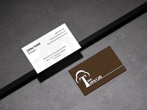
Business Card
For this business card design, I used one of my logo iterations for the back, extending its baseline to add more balance and better utilize the whitespace. I then just added a brown background to better convey the tree/nature vibe of the brand. On the front, I reused the root graphic from one of my unused logo ideas, applying a low opacity so as not to distract from the important contact information.
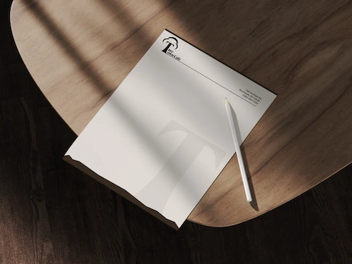
Letterhead
With the letterhead, I used a typical letterhead format with the main information in the top right corner and the logo in the top left. To make it unique, I created a brown bar at the bottom to resemble dirt, and I included the logo's "T" emerging from it. This detail maintains the logo's tree symbolism and strengthens the consistency of the brand aesthetic.
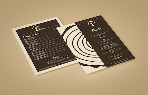
Menu
Finally, for the menu, I continued using the brown featured in the other brand materials, but instead of white, I paired it with a cream color. I wanted it to give off a more warm/inviting feeling since it would be something customers would interact with frequently. Other than that, I used a similar font to what Tree Town Cafe was already using for the headers to maintain familiarity, and also incorporated a half-stump graphic into the drink side of the menu to further reinforce the theme.